
Blog Post Draft: Beyond the Cut
- John Paul Todd-Pantaleon
- Apr 9
- 1 min read

Updated: Apr 13
Balancing Vision and Reality to Define the Platinum Barbers Identity
In branding, there is often a gap between a "good-looking logo" and a design that actually communicates a feeling. When I started working with Platinum Barbers, the goal was clear: we weren't just branding a place to get a haircut. We were branding a first-class experience a space for highly skilled, elite professionals.
The Challenge: Vision vs. Reality
Early in the process, I hit a wall. The initial designs looked clean, but they didn't feel "Platinum." They lacked the weight of a luxury brand. The challenge was to bridge the gap between a creative, whimsical touch and the sharp, sophisticated precision that a high-end client expects. Luxury isn't just about gold or silver; it’s about the feeling of being in capable hands.
The Pivot to Precision
I had to reverse-engineer the "luxury" feel. I moved away from standard barber shop tropes and focused on the mechanics of the design—cleaner lines, balanced weights, and a sense of architectural structure. I wanted the logo to feel like a badge of excellence for the barbers and a promise of quality for the clients.
The Result
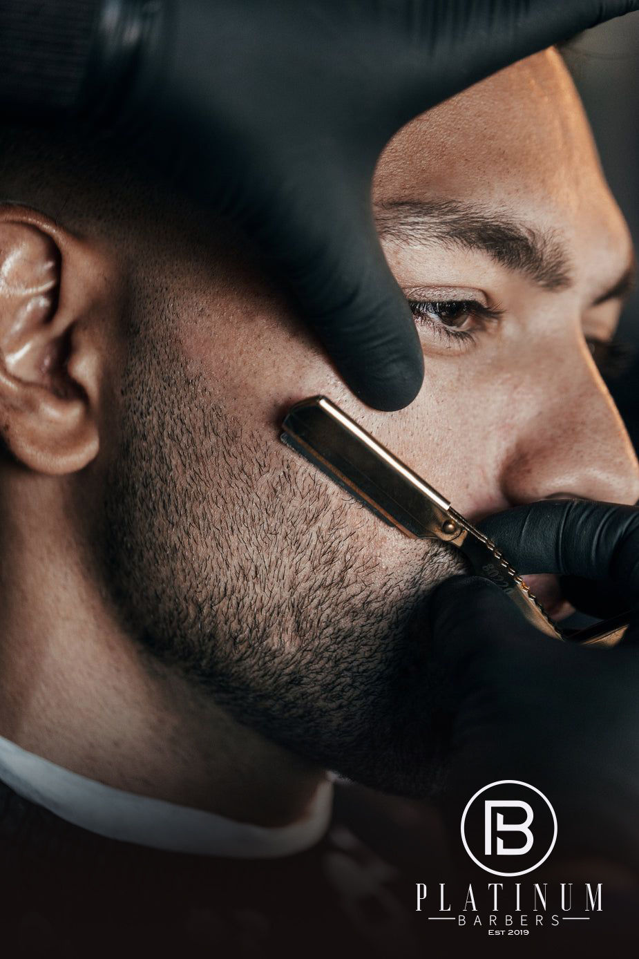
The final identity reflects the "First-Class" treatment Platinum Barbers provides. It’s a visual representation of skill, training, and premium service. By pushing through those early versions that weren't quite hitting the mark, we arrived at a brand that doesn't just look good on a window—it commands respect the moment a client walks in the door.


Comments