top of page


Care, connected
Helix Sera is a medical group built around people. The identity needed to feel trustworthy and modern, and calm enough to put patients at ease from the first visit.

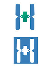

Visual approach Symbol:
An H made from two strong pillars, joined at the centre by a medical cross, to show care and community working together.
Two-tone balance: blue for trust and expertise, green for health and renewal. Friendly clarity: a rounded wordmark that feels approachable, easy to read and ready for signage and screens.
Core services
Identity design / Signage and wayfinding Patient materials / Brand guidelines
The Identity System
Logo and emblem:
A pillar H with a green cross, paired with a two-colour wordmark and a quiet grey descriptor.
Typography:
A soft, rounded sans for headings, with a clean sans for patient information.
Colour palette:
Clinical blue and fresh green on white, with grey for support.
Graphic elements:
Vertical pillar shapes and a cross motif used as icons and dividers.
Applications


The Experience


bottom of page